5 Reasons Users Leave Your Site Immediately and How to Fix Them
- by Ilona K.
Table of contents
Users visit a website with a specific purpose like searching for information, making a purchase, or booking a service. Usually they decide in the first few seconds whether your website meets their needs. Let’s explore how users make this decision and what factors influence it, as well as what steps are necessary to keep visitors engaged.
Recent research found that differences in website complexity can affect how users perceive and experience a page. Users want to know in the first seconds where they are, what the company offers, and what their next step is. If this requires additional effort, the likelihood of abandonment increases significantly.
Let’s look at the main issues that can cause a visitor to abandon a website and discuss how to resolve themю
Slow Site Speed
Why Users May Leave
Users expect a page to load almost instantaneously, regardless of their device. When loading takes a long time, they become anxious and doubt whether they should continue interacting with the site or whether it even works. Even small delays can reduce engagement and the number of targeted actions.
According to a page speed survey by Unbounce, a Canadian technology company, 45.4% of shoppers are less likely to make a purchase if the page takes longer than four seconds to load.
As well as brand perception, speed affects usability. A slow website can create the impression of an outdated service or a neglect of the customer experience.
It’s especially important to consider that a significant portion of users today visit websites on smartphones. Mobile visitors often have less stable connections and become impatient more quickly.
How to Fix It
The first step is to understand what exactly is slowing your website down. Most often, problems are related to unoptimized images, too many third-party services, heavy scripts, or improper website configuration.
Regular speed testing is essential after design updates or the addition of new features. Some improvements come with a trade-off between visual appeal or functionality and performance. For instance, a video background or a parallax effect can make a homepage more engaging, but those also require additional media files and scripts to load. Whether it’s worth the performance cost depends on the role of the element; if the video communicates something important about the product or significantly improves conversion, keeping it may make sense. If it is purely decorative and adds several seconds to loading, a static image or a lighter animation may be a better choice.
As a general benchmark, aim for your key pages to meet Google’s Core Web Vitals thresholds. For example, the Largest Contentful Paint (LCP), which measures how quickly the main content becomes visible, should be 2.5 seconds or less. The Interaction to Next Paint (INP), which measures how quickly the page responds to user interactions, should be 200 milliseconds or less, while the Cumulative Layout Shift (CLS), reflecting the visual stability of the page, should be 0.1 or less.
To check your website’s speed, you can use free analysis tools such as Google PageSpeed Insights or Lighthouse.
You can improve your website’s loading and performance speed by doing the following:
- Optimize images and use modern formats. Large images are one of the main causes of slow page loading. There’s no point in uploading a 3000-pixel-wide photo to be displayed in an 800-pixel-wide block. If your website supports modern WebP or AVIF formats, favor them over JPEG and PNG to further reduce file size.
- Optimize the order in which scripts load. Not every script needs to load before the user can see and interact with the page. Essential resources should be prioritized, while non-critical scripts, such as some analytics tools, chat widgets, or advertising scripts, can often be loaded later or asynchronously. This allows the browser to display the main content sooner instead of waiting for every script to finish loading.
- Set up caching. This allows the browser to save some website files to avoid reloading them each time you visit. This is especially useful for persistent pages whose content doesn’t change frequently.
- Check the quality of the hosting. Sometimes the problem isn’t the website itself, but the hosting server. If your site remains slow even after optimizing your content and code, it’s worth checking your server response time and, if necessary, considering a more powerful hosting or plan.
- Check your domain’s DNS (Domain Name System) records. Website speed depends on more than just content and servers. If your DNS records are configured incorrectly or queries are processing slowly, this can increase the time it takes for a page to load. Check that your primary records (A/AAAA and CNAME) point to up-to-date servers and services. It’s worth making sure your domain doesn’t have any redundant or outdated records that are no longer in use. Also, pay attention to the TTL (Time to Live) which is the amount of time a DNS record can be cached for. A value that’s too high results in DNS record changes taking longer to propagate, while if it’s too low, this will force record queries to be performed more frequently. You can use tools like Google Admin Toolbox Dig or DNSChecker to check your DNS.
Unclear Product Offering

Why Users May Leave
One of the key mistakes websites make is to talk about the company without explaining to visitors what products or services it offers - in plain language.
Sometimes businesses use words like ‘innovative solutions,’ ‘integrated approach,’ or ‘digital business transformation.’ Such phrases may sound fancy at first, but they don’t help people understand the core of what you offer and why it’s useful for them. This can also happen when businesses rely on AI-generated content without reviewing and adapting it for their audience. AI tools can produce grammatically correct and polished copy, but if the text is too generic or filled with vague marketing language, it may make the company’s offer even harder to understand.
The same problem can occur when the information on the website doesn’t match what brought the visitor there in the first place. For example, a user may click on an ad offering 50% off, only to land on a website where all products are shown at full price because the promotion has already ended. Even if the offer was legitimate when the ad was created, the mismatch can make visitors feel misled and quickly lose trust in the company.
On opening a good website, visitors should see the answer to a simple question: ‘What can this company do for me?’
How to Fix It
Start by redesigning your home screen. Instead of simply describing your philosophy, the headline should be specific, user-focused and clear. Too abstract:
‘We create innovative digital solutions for modern businesses’
More user-friendly:
‘We develop websites for e-commerce’
It’s also essential to consider that different users come to the website with different expectations and goals. A new user will first want to understand what the company does and whether its offerings are suitable for them. Someone already familiar with the brand might immediately search for a specific service, catalog, contact information, or support section. Therefore, it’s best to structure the content so that the relevant options for the commonest customer circumstances are available at first glance. For instance, on an online store website, you can simultaneously display product categories and purchasing benefits on the main page, while making the search, menu, and personal account accessible without additional clicks.
Make sure your website also reflects your current offers and promotions. Regularly check active advertising campaigns and update or remove outdated promotions from both ads and landing pages. If an ad promises a discount, free delivery, or another special offer, visitors should be able to find the same offer when they arrive on the website. Keeping these messages consistent helps avoid confusion and preserves trust.
The easier it is for someone to understand your offer, and the closer that offer matches what they expected to find, the more likely they are to continue interacting with the website.
Complex Navigation
Why Users Leave
Research by the Baymard Institute, a research institute specializing in UX (User Experience) design and e-commerce usability, shows that navigation issues remain one of the most common mistakes of website design: 58% of desktop and 67% of mobile websites received a ‘mediocre’ or lower rating for navigation ease.
A frequent blunder is to design a website from a business standpoint without considering the customer’s needs. It may seem reasonable from the company’s perspective to include sections with titles like ‘Solutions,’ ‘Ecosystem,’ or ‘Features’, but the visitor may not understand what’s inside. For instance, if someone is looking for online store development services, they’re more likely to search the ‘E-commerce Development’ or ‘Services’ menu rather than guess that the information they need is in the ‘Solutions’ section. The closer the section titles are to the user’s needs and goals, the easier it’s to navigate the site.
In UX design, this is related to the concept of cognitive load, the amount of personal effort required to understand an interface. When a page’s structure is logical and key information is located where the user expects it, interaction becomes easier. However, if visitors have to search for answers to basic questions, navigate, or guess what to do next, the likelihood of abandonment increases.
Good navigation shouldn’t answer the question of ‘How can we organize information conveniently?’ but rather ‘How will the user find it?’
How to Fix It
Start by understanding the main tasks users might face when visiting your site:
- potential clients who want to understand what services you offer and how much they cost;
- buyers looking for a specific product and who want to place an order;
- regular customers looking for contact information, their personal account, or the support section.
For each scenario, let’s examine the user’s journey and consider how many steps they need to take to get the information they need or complete their task. If they have to open multiple pages, go back, or guess where the desired section is, the navigation should be simplified.
To make navigation simpler and more convenient, you should:
- Use clear names. ‘Services,’ ‘Pricing,’ ‘Catalog,’ ‘Delivery,’ or ‘Contacts’ are clearer to users than internal company names like ‘Solutions,’ ‘Ecosystem,’ or ‘Opportunities.’
- Don’t overload the menu. It’s better not to put all your site pages there. Try to keep a few main sections there and place secondary ones in nested menus or the footer.
- Place important pages where they are easy to find. For this, check your analytics data. If visitors frequently use search to find prices, delivery terms, or contact information, this may be a sign that the relevant information isn’t prominent enough in the navigation.
- If the site has a lot of content, add a search function. For an online store, this could be a product search, while for a corporate site, it could be a search for articles, documents, or services.
- Use breadcrumbs on large sites. They show users where they are in the site structure and allow them to quickly return to the previous level.
After making changes, test whether the new arrangement actually helps users find the information they need faster. If you have sufficient traffic, this can be done using A/B testing; show some visitors the current navigation version and others the modified version, and compare the results. For instance, you can test whether the number of clicks to key sections has increased, whether the time to a target action has decreased, or whether the proportion of users leaving the site after viewing one page has decreased.
The Website Isn’t Responsive on Different Devices
Why Users Leave
Today, a website should work equally well on a computer, smartphone, or tablet. Users rarely think about which version of the site they’re viewing, they simply expect a user-friendly experience.
If the mobile version is unusable, it immediately impacts the public perception of the company. Small text, buttons that are difficult to reach, slow loading times, or elements that extend beyond the screen create an impression of unprofessional service.
This problem is especially pressing as mobile traffic increasingly accounts for a significant portion of the internet audience. According to StatCounter, a web analytics service, mobile devices now represent the majority of global web traffic.
Responsiveness for these devices isn’t simply about creating a scaled-down version of a desktop website. A well-designed mobile version should take into account the specific behavior of smartphone users characterised by short sessions, finger-based navigation, and the need to find information quickly.
How to Fix It
Start by testing the website on a smartphone or tablet. Beyond ensuring the page actually opens, it’s crucial to evaluate how easy it is to interact with. Users shouldn’t have to zoom in on the text, scroll horizontally, or tap a small button multiple times to access the desired element.
Start by checking these key elements:
- Text should be easy to read without zooming in on the page. If the user has to zoom in, the font size or page zoom should be reconsidered.
- Buttons and links should be sufficiently large and placed at a comfortable distance from each other so they can be easily selected by finger touch.
- Menus should remain clear on small screens. Users should be able to open them easily, find the desired section, and return to them again and again.
- Pop-ups and banners shouldn’t obscure the main content or interfere with tapping an important button. This is especially true for mobile devices, where screen space is much smaller.
When developing a new website, it’s best to prioritise responsive design and an approach in which the page structure and elements adapt to the screen size. Don’t create a desktop version first and then try to adapt it for smartphones; this can lead to awkward navigation and issues with individual elements. If you’re creating a website yourself, you can use a website builder that supports responsive design. Many of these platforms automatically optimize pages for different device types.
You can check how well your website performs on mobile devices using Google tools. Lighthouse allows you to evaluate page performance and identify issues that affect the mobile user experience. Google Search Console allows you to monitor the overall user experience on your website. This service also displays Core Web Vitals, metrics that help evaluate how quickly the main content loads, how quickly the page responds to user actions, and whether its content remains stable during loading. These characteristics are taken into account when assessing the Page Experience, that is, the overall usability of the page for the visitor.
For a more comprehensive assessment, it’s worth testing the pages that users most frequently access from search engines, ads, or social media. This is where mobile issues can cost you potential customers.
Intrusive Pop-Ups
Why Users May Leave
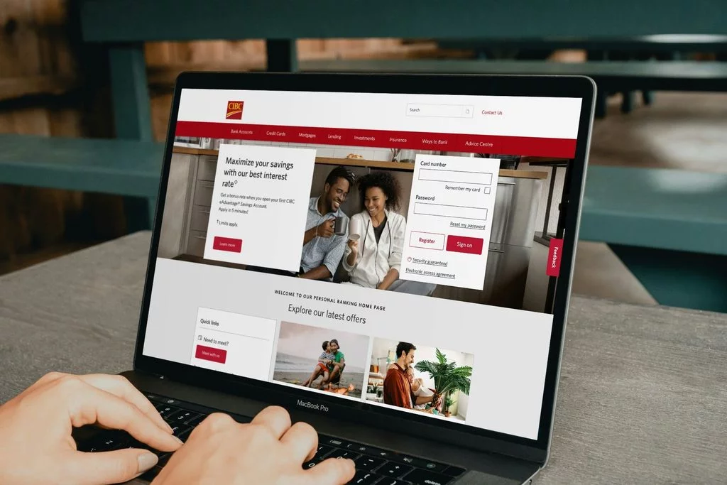
Pop-ups in themselves aren’t a problem. They can help collect leads, offer discounts, invite users to a consultation, or sign them up for a newsletter. The problem begins when a pop-up appears before the user has time to understand the offer or interferes with their primary action.
For example, a person who has just opened a page and as yet doesn’t understand what the company does may immediately be asked to subscribe to a newsletter, leave a phone number, or participate in a promotion.
Such elements create a sense of pressure and interfere with the user’s primary flow.
Particularly negatively received pop-ups are those that:
- obscure the main content;
- appear immediately after opening the page;
- are difficult to close;
- repeat too frequently.
How to Fix It
To prevent pop-ups from causing abandonment, pay attention to a few points:
- Give the user time to get acquainted with the site. It’s not necessary to show a pop-up immediately after the page loads. If the visitor came to learn about a service, first give them a chance to read the description and understand the offer, and only then offer a consultation or other step.
- Connect the offer to the page content. A pop-up should be a continuation of the user flow. For instance, on a website creation service page, you could offer a project cost estimate, while in a blog post, you could offer downloads of related material. These seem more relevant than the generic ‘Subscribe to our newsletter’ form that appears on every page.
- Don’t obscure the main content. If the offer in the pop-up doesn’t appeal, the user should still be able to continue reading or navigating. This is especially important on mobile devices, where even a small window can cover most of the screen.
- Make the close button obvious. The visitor shouldn’t have to look for a small cross in the corner or wait for the window to disappear. If a user decides to reject the offer, closing it should be as easy as accepting it.
- Don’t show the same window again too often. If the user has already closed the pop-up or left their information, there’s no point in offering them the same thing every time they visit the site.
- Test different options. A/B testing will help you understand whether the pop-up is truly beneficial. You can compare different moments when the pop-up can appear, and the texts and offers they contain to see how they impact conversion and user behavior.
This way, the pop-up can become part of the user experience instead of an obstacle.
FAQs
Why do users leave a website within the first few seconds?
Most often, it happens because the website doesn’t help users quickly understand where they’re headed and what they can expect to get there. Slow loading times, unclear offers, complex navigation, mobile version issues, or intrusive pop-ups can cause visitors to abandon the site before they even get a chance to fully understand what the company has to offer.
What should be on the first page of a website?
The first page should quickly explain what the company does, who its product or service is for, and what the user can do next. A clear headline, a brief description of the offer, and a prominent call to action are usually sufficient. Don’t try to fit all the company information on the first page.
How do you understand why users leave your site?
Start by analyzing your web analytics data, see which pages users leave on most often and what actions they perform before leaving. Technical issues can be checked using Google PageSpeed Insights and Lighthouse, and Google Search Console can help identify issues with user experience metrics. If you’re changing individual website elements, such as a menu or pop-up, you can compare their effectiveness using A/B testing.
Should you use pop-ups on your website?
Yes, if they help the user and solve a specific business problem. It’s crucial to choose the right moment to display the pop-up, tie the offer to the page content, make it easy to close, and avoid displaying the same pop-up too often. A/B testing can help you understand whether a pop-up actually increases conversion or in fact increases abandonment.
How can I make website navigation easier?
Use clear section titles, avoid cluttering the main menu, and place important pages where they’re easy to find. If your website has a lot of products, services, or content, add a search feature and, if necessary, breadcrumbs. Focus on the user’s needs, not the internal structure of your company; it should be clear to visitors where to find the information they need.
Want to know more about website solutions for your business? Visit it.com Domains blog and follow us on social media.

Read also

Tips and Tricks
Phishing with Fake Impersonating Domains: How Business Can Recognize It and Guard
- 10 min read