The Future of Web Design: 2023 Trends and Innovations
- by Ilona K.
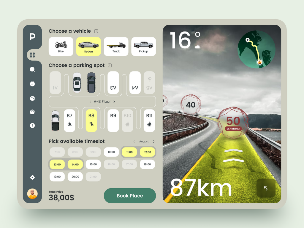
Web design is key for any brand’s success online. As we’re getting into the last leg of 2023, to help you shape your web strategy for 2024, here are some prominent web design trends and the innovations powering them.
The power that web design has over how websites are perceived is hard to overestimate. 90% of the information processed by the brain is visual, and it’s processed 60,000 times faster than text.
However, approaches to web design are continuously evolving to reflect the ever-changing nature of the Internet. Web designers are no longer held hostage by computers as they can extend their creative efforts to almost any device.
Innovations power new trends, which in turn set the path for improved user experience by creating simple, clear, and versatile interfaces.
2023 web design trends and innovations
The evolution of web design goes hand in hand with key developments in internet technologies. Tech innovations define the rules of the game of web design. Also, there are the trend strategies any brand can use to win this game. Let’s look at both of them and understand how they can be useful.
Internet of Things (IoT)
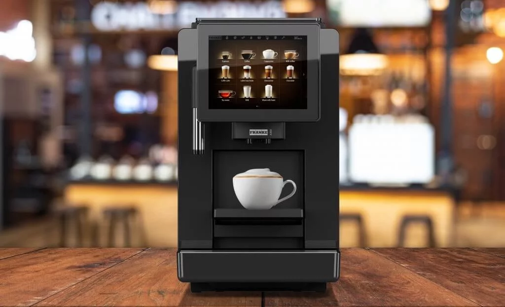
The development of the Internet of Things is going at a tremendous pace, and most IoT devices can display web content. Now that even a fridge or coffee machine can display a website, web designers need to consider adaptive interfaces which are device-agnostic.
Artificial Intelligence (AI) and Machine Learning (ML)
AI is a hot topic across many sectors, and web design is no exception. AI visualisation tools like DALL-E and Midjourney can help to quickly mock up ideas, while smart prompts across Figma, Canva and Adobe XD speed up work on layouts. As a result, web designers can focus on more creative and strategic aspects of design, while AI takes care of the more mundane tasks. A few more examples of AI-powered design include:
- Dynamic content based on user interests. This is often found on social media, where content is recommended to users based on their likes and the profiles they follow.
- Optimisation of voice and text search in the browser. AI can help structure websites’ information architecture to support quick discovery by smart search assistants.
- Selection of colours and interface personalisation. AI can support A/B testing with multiple variations of colours, CTA buttons, interface options, etc.
Voice User Interface (VUI)
With the rise of assistants like Amazon’s Alexa and Apple’s Siri, voice user interfaces (VUI) have become increasingly popular. VUI enables users to interact with devices and websites using their voice instead of typing.
In the coming years, the influence of VUI will continue to grow, compelling web designers to adapt websites and other devices for voice assistants. A good VUI allows users to easily find the information they need and interact with the website using voice commands.
Virtual Reality (VR) and Augmented reality (AR)
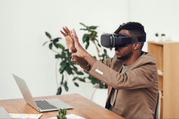
VR and AR technologies, although not new, are only now gaining popularity and wider distribution. AR and VR are widely used in education, media, healthcare, marketing, virtual stores, and various online services. With the help of VR and AR technologies, web designers can create more engaging and interactive user interfaces and boost user experience.
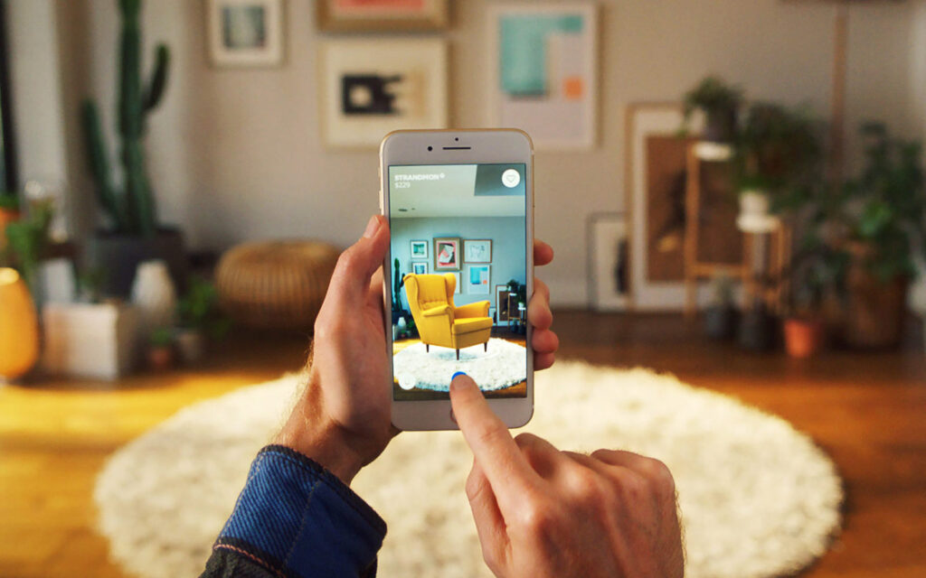
The IKEA website excels in its use of AR, allowing users see how their products would look in any interior.
Chatbots
Another integral part of web design is chatbots. This is another trend which has been with us for a while and it is becoming increasingly important. So-called conversational design is becoming an integral part of the website experience.
Conversational design engages users with conversation-like features. Basic rules for designing conversations for software featured in Google Design resources and described by many UX professionals include:
- Don't turn chat into an app. Complex, multi-step menus look better inside applications than in chats. Communication with a bot usually follows the pattern “request from user” > “response from bot” without serious branches.
- The dialogue should be simple. There is no need to build a branching tree of dialogues and provide for all possible user responses. The user will very quickly get tired of complex dialogues. It’s absolutely normal if the bot clearly sets the boundaries within which it operates.
- Commands and sets of buttons are ways to make the user's response structured. Therefore, pay attention to their design. They should be intuitive and attention-grabbing. A well-designed conversational interface should make it clear what happens when a specific quick response is selected. Users should be able to predict the results of their actions.
- The design of the chatbot should correspond to the main design of the website. It should fit harmoniously into the overall environment.
Adaptive design
Various marketing studies agree that most users will leave a website if it doesn’t display correctly on their device, whether it’s a computer, tablet, or smartphone.
The present and future of web design focus on enabling users to get content on websites that display equally well on all devices, regardless of screen size.
Single-page website
Businesses and users don’t always need large, multi-layered websites with a lot of information. Therefore, some brands are turning to one-page websites to display all information in one place and save money on maintenance. Users just need to scroll up or down, without the hassle of menu navigation. And Apartments' website - a luxury living apartment complex in Braddon, Australia - is a good example of a one-page website.
From a web design perspective, it’s key to nail an interface that will feature all required content and yet stay clean and easy to navigate.
Dark theme
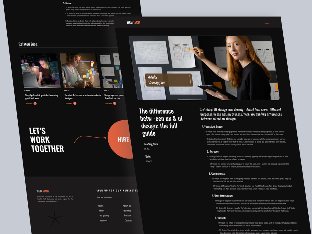
Dark themes have become popular among users of social media and mobile apps. Web designers have jumped onto that trend by creating two versions of websites and application; light and dark.
Here are a few reasons why this trend will remain popular in the coming years:
- It's stylish.
- Dark themes save battery life.
- There’s much less eye strain.
- At night, content in a dark theme is much easier to decypher.
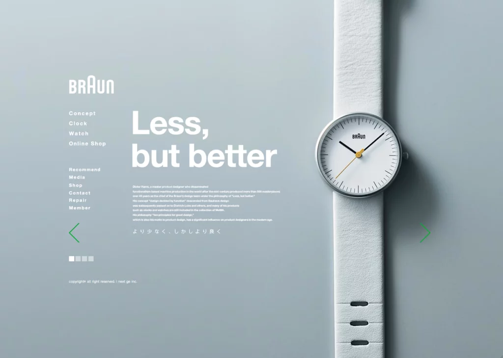
Minimalism
Light, airy, and with nothing superfluous is great website design in a nutshell. Web designers use typography, centrally placed product images, or 3D effects to keep their websites in line with the minimalism trend.
Typography
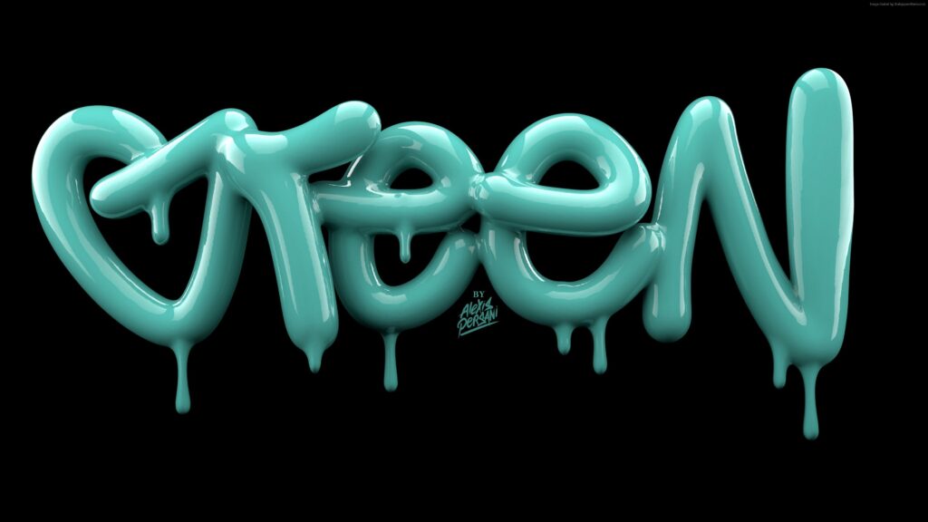
Typography is the artistic design of text using fonts, symbols and signs. Typography is powerful as it can not only make your website content more readable, but also convey your brand’s message and identity.
Some trendy typography options include:
Retro Condensed
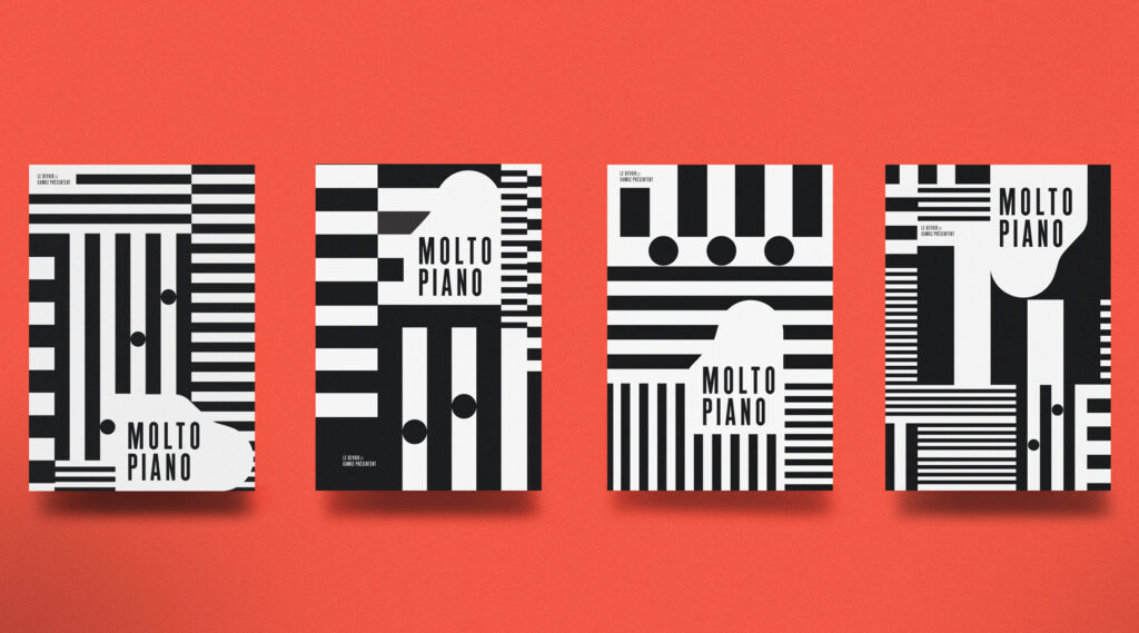
Liquified
Psychedia
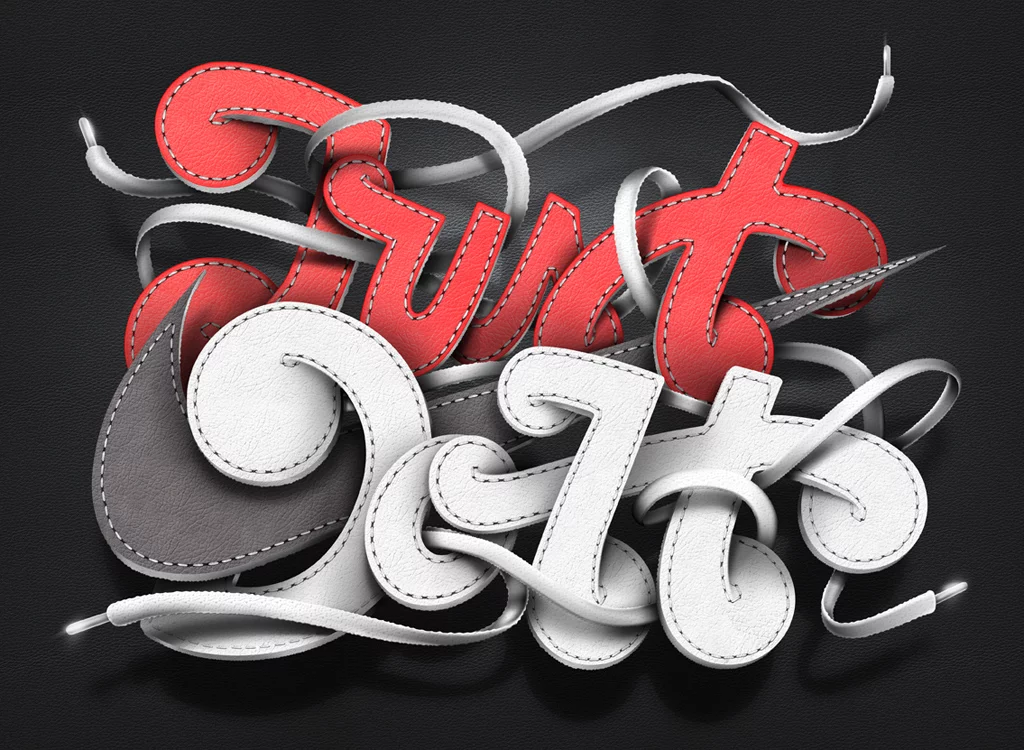
Vintage

Art Nouveau
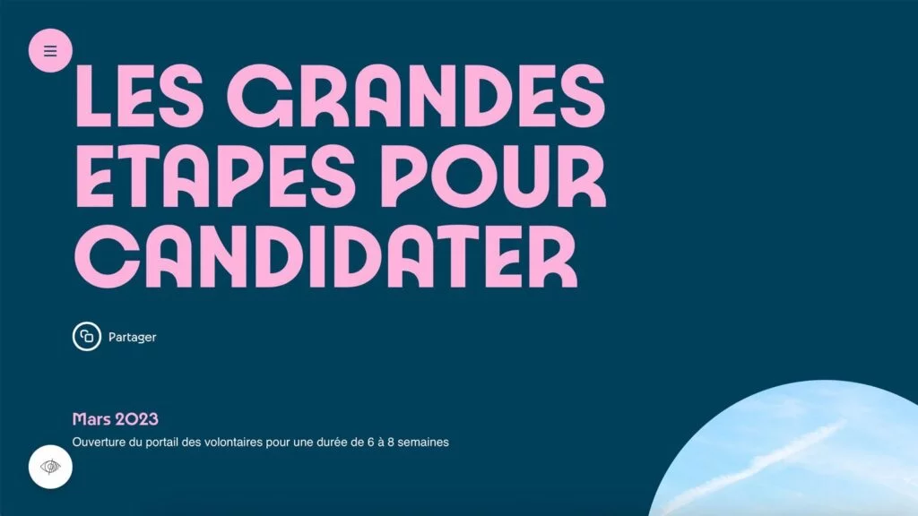
Illegible
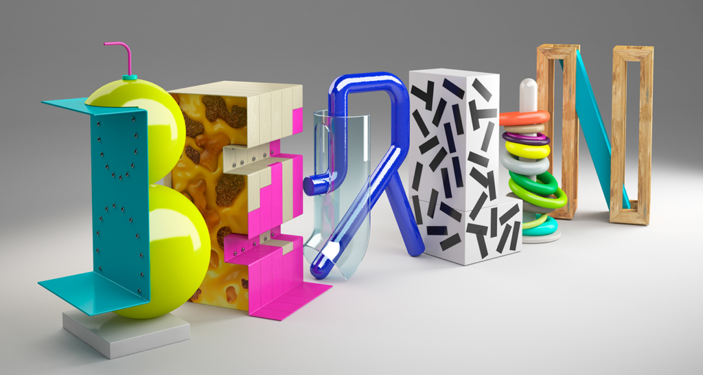
Unconvential typography is suitable for a variety of projects and websites, including festivals and creative websites. However, it may not be as effective for selling landing pages and advertising websites, unless it’s a business card website for a company that wants to showcase its creativity.
Products in the spotlight
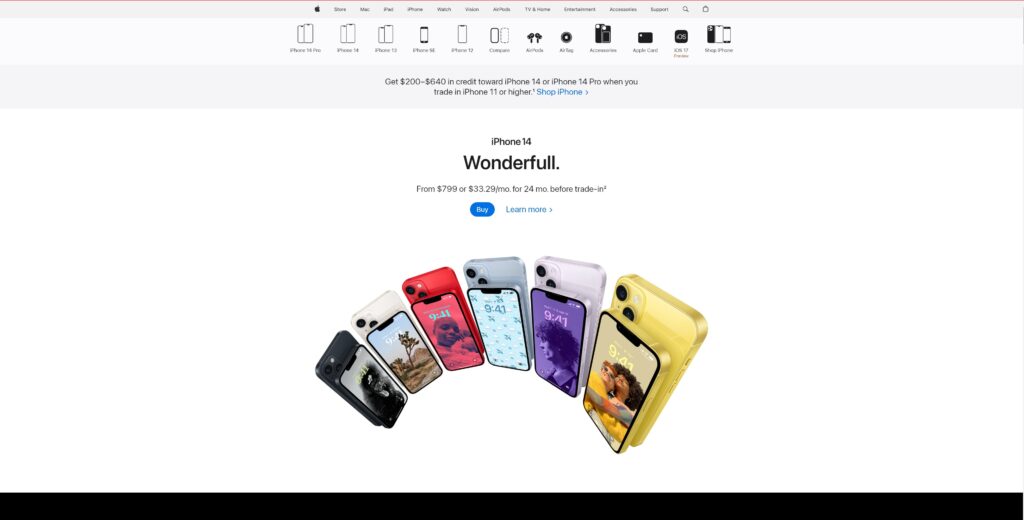
Modern web designers understand the role of product-centric design. A minimalistic and concise landing page with a product in the spotlight enables users to quickly determine whether they should continue their journey through the website.
3D elements
3D elements will bring novelty and depth to the websites. With their help, designers can create an entire visual story that will engage users without taking up much of their time. There is also a trend for overlaying layers and shadows, creating a 3D effect.
Overall, the future of web design will be geared to better and faster access to information, an improved user experience, and more intuitive interfaces. New internet technologies, user requirements, and changes in consumer behaviour are setting new trends, while simplicity and minimalism continue to define the overall pattern. A winning strategy for 2024 is to focus on conveying your brand’s message through a trendy yet user-centric web design.

Read also
